🎉 BoldForm Pro Launch Offer: Get Up to 70% OFF — Limited Time Only!

Every field a form could ask for, Already Built.
43
Field types
26
Free in Lite
18
Unlocked with Pro
5
Field categories
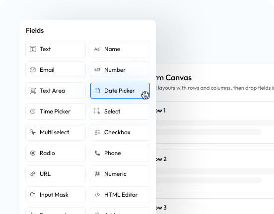



- All Fields
- Free
- Pro
- All Fields
- Basic Fields
- Choice & Rating
- Advanced Fields
- Payment Fields
- Structure & Layout
- Free
- Basic Fields
- Choice & Rating
- Advanced Fields
- Structure & Layout
- Pro
- Choice & Rating
- Advanced Fields
- Payment Fields
- Structure & Layout
Text
A single-line box for short, free-typed answers like a name or subject line.
Name
A structured name field that splits first, middle and last into their own inputs.
Validates the address is properly formatted before it reaches your inbox.
Phone
Collects and formats a telephone number for callback or SMS follow-up.
Website / URL
Checks the entry is a well-formed web address before accepting it.
Number
A numeric-only box with optional minimum, maximum and step limits.
Numeric
A stricter numeric entry field for values that need tighter formatting than Number.
Textearea
A multi-line box for longer messages, feedback or comments.
Input Mask
Locks typed input to a pattern you define — great for reference codes or IDs.
Date Picker
A calendar picker for collecting a date in a consistent, chosen format.
Time Picker
A clock-style picker for collecting a time of day.
Address
One grouped field for street, city, state, zip and country.
Country
A ready-made dropdown of every country for location selection.
Dropdown Select
A single-choice dropdown built from the options you list.
Multi Select
A dropdown that lets more than one option be chosen at once.
Radio Buttons
One choice from a visible set of mutually exclusive options.
Checkboxes
Any number of options a respondent can tick from your list.
Star Rating
A clickable star scale for a quick satisfaction or quality score.
Slider Range
A draggable slider for picking a numeric value within bounds you set.
NPS Rating
A 0–10 Net Promoter Score scale with detractor, passive and promoter colour zones.
Image Choice
Turns options into a visual picker of images instead of plain text labels.
Matrix / Grid
A row-by-column grid for rating several items on the same scale at once.
Lookup / Autocomplete
Suggests matches from a list you define as the person types.
Password
A masked entry field, with an optional confirm-password match check.
Rich Text Editor
A formatting-aware editor for bold, lists and links instead of plain text.
Date Range
A paired start/end date picker with a configurable minimum and maximum span.
Calculation
A read-only field that computes a live result from a formula referencing other fields.
Signature
Captures a hand-drawn signature and stores it as an image with the entry.
Repeater
A group of fields the respondent can add or remove rows of — guests, line items, and so on.
Geolocation
Captures the respondent's location, with an optional live map preview.
Color Picker
A swatch picker for collecting a colour value.
Hidden Field
Carries a preset or server-verified value — like a user ID or URL parameter — invisibly.
Captcha
A human-verification challenge that keeps automated spam off your forms.
File Upload
Lets a respondent attach one or more files, with type and size limits you control.
Payment Item
A list of items with prices the respondent chooses from, as radio buttons or a dropdown.
Quantity
Lets a respondent set how many of a linked Payment Item they want.
Custom Amount
Lets the respondent enter their own amount — ideal for donations — within limits you set.
Order Summary
Shows the computed total and checkout controls for everything selected in the form.
Section Break
A titled divider that visually separates one part of a long form from the next.
HTML Block
Drops custom HTML into the form for content the standard fields can't cover.
Paragraph Text
Static instructional or descriptive text — nothing is collected here.
Terms & Conditions
A required checkbox tied to your linked terms text that must be accepted to submit.
Page Break
Splits a long form into multiple steps with a progress indicator.
Submit Button
The form's submit control, with a customisable label and style.
Text
A single-line box for short, free-typed answers like a name or subject line.
Name
A structured name field that splits first, middle and last into their own inputs.
Validates the address is properly formatted before it reaches your inbox.
Phone
Collects and formats a telephone number for callback or SMS follow-up.
Website / URL
Checks the entry is a well-formed web address before accepting it.
Number
A numeric-only box with optional minimum, maximum and step limits.
Numeric
A stricter numeric entry field for values that need tighter formatting than Number.
Textearea
A multi-line box for longer messages, feedback or comments.
Input Mask
Locks typed input to a pattern you define — great for reference codes or IDs.
Date Picker
A calendar picker for collecting a date in a consistent, chosen format.
Time Picker
A clock-style picker for collecting a time of day.
Address
One grouped field for street, city, state, zip and country.
Country
A ready-made dropdown of every country for location selection.
Dropdown Select
A single-choice dropdown built from the options you list.
Multi Select
A dropdown that lets more than one option be chosen at once.
Radio Buttons
One choice from a visible set of mutually exclusive options.
Checkboxes
Any number of options a respondent can tick from your list.
Star Rating
A clickable star scale for a quick satisfaction or quality score.
Slider Range
A draggable slider for picking a numeric value within bounds you set.
Captcha
A human-verification challenge that keeps automated spam off your forms.
File Upload
Lets a respondent attach one or more files, with type and size limits you control.
Section Break
A titled divider that visually separates one part of a long form from the next.
HTML Block
Drops custom HTML into the form for content the standard fields can't cover.
Paragraph Text
Static instructional or descriptive text — nothing is collected here.
Terms & Conditions
A required checkbox tied to your linked terms text that must be accepted to submit.
Submit Button
The form's submit control, with a customisable label and style.
NPS Rating
A 0–10 Net Promoter Score scale with detractor, passive and promoter colour zones.
Image Choice
Turns options into a visual picker of images instead of plain text labels.
Matrix / Grid
A row-by-column grid for rating several items on the same scale at once.
Lookup / Autocomplete
Suggests matches from a list you define as the person types.
Password
A masked entry field, with an optional confirm-password match check.
Rich Text Editor
A formatting-aware editor for bold, lists and links instead of plain text.
Date Range
A paired start/end date picker with a configurable minimum and maximum span.
Calculation
A read-only field that computes a live result from a formula referencing other fields.
Signature
Captures a hand-drawn signature and stores it as an image with the entry.
Repeater
A group of fields the respondent can add or remove rows of — guests, line items, and so on.
Geolocation
Captures the respondent's location, with an optional live map preview.
Color Picker
A swatch picker for collecting a colour value.
Hidden Field
Carries a preset or server-verified value — like a user ID or URL parameter — invisibly.
Payment Item
A list of items with prices the respondent chooses from, as radio buttons or a dropdown.
Quantity
Lets a respondent set how many of a linked Payment Item they want.
Custom Amount
Lets the respondent enter their own amount — ideal for donations — within limits you set.
Order Summary
Shows the computed total and checkout controls for everything selected in the form.
Page Break
Splits a long form into multiple steps with a progress indicator.